Usually, planning an outside function in Las Vegas is as close as a sure bet as you can get. With about 300 days of sunshine each year, the owners of the (then) Cosmopolitan Resort & Casino didn’t expect October 25, 2005 to dawn gray and wet. But that was exactly what happened. Organizers were forced to shepherd hundreds of guests into the trailers that served as the sales pavilion as the rain poured down outside.
The impromptu ceremony featured speeches and presentations from players who were nonetheless optimistic that the Cosmopolitan would be a success. On that day, the teeming rain didn’t seem to be a bad omen, just a temporary inconvenience.
And then the recession hit.
It started slowly but reached critical levels quickly. Some of the Strip’s most high-profile developments—planned or under construction—were halted. Condo projects, which was an important element of the Cosmopolitan, were hardest hit.
But the Cosmopolitan soldiered on. Even when the first set of owners ran out of money, the lender, Deutsche Bank, continued funding the construction. After some fits and starts and a new name, the Cosmopolitan of Las Vegas debuted in December 2010 to plaudits and applause from many visitors and design experts. Occupancy rates and ADR have been off the charts. The “buzz” factor has been incredible. And the Strip now has a new “must-see” attraction. But then we’re getting ahead of ourselves.
Birth of an Idea
The Cosmopolitan Resort & Casino was spawned by New York real estate developer Ian Bruce Eichner and former Las Vegas Sands executive David Friedman. Along with other partners, they had an idea to bring a new stylishness to the Strip that would be unlike anything experienced in Las Vegas.
But the site had to be right, and that turned out to be tricky. At that time on the Strip, development had pushed up the prices of land to something like $20 million an acre for prime real estate, so finding the “location, location, location” was a challenge.
It soon became apparent that a plot of land between Bellagio and the soon-to-launch CityCenter fit the bill. The only problem was the size. At 8.7 acres, it clearly was undersized for a major Las Vegas resort.
Brad Friedmutter, the president of the Friedmutter Group, was there from the start. He says the owners considered several different locations before making the final decision.
“It was the right ‘neighborhood,’” says Friedmutter. “There were other, larger, sites, but this one had the right pedigree.”
With experience in all jurisdictions, Friedmutter says the only place lacking on his résumé was the Las Vegas Strip.
“So we were very excited about getting this project,” he says. “And not just any project, but such a significant project.”
The initial construction was complicated. Excavation went down 10 stories below the Las Vegas Strip, with walls thick enough to stand on their own.
“It’s like an upside down building with another building sitting on top of it,” says Friedmutter.
But as the economy worsened, Friedman and then Eichner (along with one of the original designers, Arquitectonica) exited the project, leaving Deutsche Bank with an important decision to make: stop construction or finish the job.
When the company decided to proceed, Deutsche Bank brought in the Related Group to handle the logistics of coordinating the final design and construction plans. The company has vast experience coordinating such projects, but time was of the essence.
Ron Wackrow, executive vice president of Related, says it was a good marriage.
“We’re a New York company and we have extensive experience in this kind of construction,” he says.
That experience extended to working with the best designers in the world, and one of the first to be retained by Wackrow was David Rockwell, who has extensive gaming background, having been recognized with the Sarno Award for Lifetime Achievement presented by the American Gaming Association in 2008.
One of the first decisions made by Wackrow and his team was to move the casino, which was placed on the second floor in the original plans, down to the first floor and adjacent to the Strip.
“Having worked on gaming projects in the past, we realized that the location of the casino was a problem right from the start,” says Wackrow. “When we considered where to move it, it just opened up some great options. That decision changed many of the elements you see today. First of all, it reduced the amount of retail, which we realized was too much, so it accomplished two goals. By putting the casino on the first floor, we were able to create an immediacy that works very well in the final product.”
Friedmutter agrees that the decision was a good one.
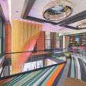
“When Related came in, we decided the casino should go to the Strip, which opened up the retail area to create the three-story element that became the Chandelier Bar.”
John Unwin, CEO of the Cosmopolitan, believes the decision transformed the entire property.
“It put the lobby and the front desk in the right place,” he says. “It also helped to ‘right-size’ the retail offerings. We have about 65,000 square feet of retailers. We see them as luxury redefined. The super high-end logos wouldn’t work in here. So we really had the opportunity to find some unique retail offerings that are no
t as widespread as the other luxury brands. It was the right thing to do to concentrate on 13 or 14 shops rather than create another mall.”
Central Feature
The re-design of this space opened
up an atrium area that attracted Rockwell and became the signature of the Cosmo-politan.
“The space that eventually became the Chandelier was supposed to be a feature that would be a central draw,” he says. “Las Vegas is defined by change, and we believe this is a reinvention of what Las Vegas is. And it’s not just one thing—gaming, entertainment, dining, retail—it’s a combination of all those things that create a unique experience.
“At the Cosmopolitan, we felt there was an opportunity to represent this, particularly because of how vertical it is.”
Using that verticality, Rockwell says that the Chandelier “gives people the thrill of inhabiting something as dramatic as a chandelier.”
That required a larger hole that extended the vertical feature in a wider circumference, extending to the second and third levels.
“We designed the ways to move through the space in that area,” says Rockwell, “so it was exciting to look at from the outside and from the inside.”
Unwin says the creation of the Chandelier reflected the cooperation that was necessary throughout the project.
“The design of the Chandelier Bar was done in a collaborative fashion with the lab at Rockwell,” he explains. “The furniture, fabrics, crystals, even down to the images we project on the crystals were all done together.”
Rockwell says the inspiration for the space was to define the entire Cosmopolitan experience.
“The chandelier is the object that is the epitome of what the Cosmopolitan stands for,” he says. “It attracts and pulls you through the casino from either direction. The access to the casino is nearby and the chandelier is a fantastic symbol of glamour. Making it big enough to actually inhabit, it would be both familiar and surprising.”
Wackrow says the Chandelier was a labor of love.
“We really liked the concept,” he says, “but it was going to be difficult to pull off. First, the delicacy of the crystal strands had to be addressed, and then, how the people flow through the feature became an issue.”
By creating a mid-level lounge above the main floor but below the mezzanine, visitors feel secluded and exclusive, but still a part of the action.
As for the chandelier itself, Rockwell says they went through several iterations for the beads. Once they settled on them, how to hang them became a challenge.
“The beads are threaded through steel cables,” he explains. “The cables are designed to hold a certain amount of weight, but then detach if too much weight is put on them.”
Beautiful and strong.
Access Issues
With a small footprint, the 2,995-room Cosmo-politan was bound to break some Las Vegas rules. The first one had to be the placement of ingress and outflow for vehicles. Chuck Jones, a senior vice president with the Friedmutter Group who was actively involved in the original designs, says the decision of how to deal with the porte cochere wasn’t a difficult one.
“We looked at several locations,” he says. “We knew we wanted to maximize useful building square footage on the site, and we also knew we wanted to keep the Strip open for pedestrians, so anything with vehicles had to be on the west end. That was simply the rationale.”
But for firms with experience in construction in major cities, the Cosmopolitan was simply another vertical building. Jones says this would not be the first time that the designers broke a Las Vegas tradition.
“While this broke the paradigm in Las Vegas, it exists in any major metropolitan city, so we were confident it would work here,” he says.
Unwin says he was concerned about the flow of vehicle traffic, but he needn’t have been.
“It’s so different than what people are used to in Las Vegas,” he says. “But so much thought and effort was put into what we perceived to be a challenge, I think it actually has been a positive for
us. I felt pretty comfortable with it, but I didn’t think it would actually turn into an advantage.”
The verticality of the hotel minimizes the physical spaces that confront visitors. Unwin says the multi-level, subterranean parking garage whisks visitors from their cars to the casino, restaurants or entertainment options in seconds.
He also believes the “walkability” of the project and the access to the Strip has become a huge advantage.
“I don’t think anybody has embraced the Strip in this way for many, many years,” he says, “particularly at this end of the Strip. Every day, there are 60,000 to 90,000 people walking in front of our property. That’s been tremendous exposure for us, coupled with the relative ease of getting in and out through the two vehicular entrances. This has really been received well by customers.”
Many of those customers are Las Vegas residents who appreciate the ease of access.
“We’ve got some great support from the local community in Las Vegas,” he says. “They appreciate the indie spirit we bring to the Strip. It makes it more interesting for them and their guests when they’re showing them the Strip.”
Market Function
Though the general market of the Cosmopolitan had been identified early on, it wasn’t until Unwin joined the project in 2008 that the target audience was clarified. And it’s that audience that influenced the design of everything from that point on.
Unwin’s description of the typical Cosmopolitan customer was the catalyst for creativity from many of the designers.
“Part of what we were trying to create was a market opportunity and a customer we call the ‘curious class,’” says Unwin. “And central to the needs of these customers is to create a sense of exploration, so that as you go around every corner, there’s something new and interesting there. That’s how the restaurant neighborhood was set up. That’s how our art program was set up, from the ‘art-o-mat’ machines to the 7-foot-tall high heel in the commons area.”
Wackrow says that when Related was hired, it was crucial to understand who the customer was.
“We wanted to examine what we thought the DNA of the Cosmopolitan would be,” he says. “We envisioned a building that had a sense of performance, that was able to change and transform.”
Rockwell wanted to deliver his signature touches to an audience who would appreciate them.
“They (Cosmopolitan executives) knew that this was going to fall in between the adventurous traveler who wants a boutique hotel and the frequent visitor to Las Vegas who wants a sense of luxury,” he says. “It became very clear as we went on that they believed this was an opening in the market they wanted to fill.”
Unwin says the response from the design group after he clearly outlined who the Cosmopolitan customer would be was dramatic.
“Once we clearly articulated what our brand was, the team we assembled truly understood,” he says. “It was like a light went on and it made the decision-making process that much easier.”
Up and Down
The small site of the Cosmopolitan has created a large hotel with a small feel. The idea an almost 3,000-room property is referred to as a “boutique” hotel seems rather ludicrous, but Unwin says it was essential to the property’s success.
“It was critical to establish the boutique feel,” he says. “The footprint is so small it creates a much more intimate feeling.”
The verticality of the property was an element that could have turned into a negative. In fact, it was an established fact in Las Vegas that you can’t force customers to move up more than one floor (not counting the rooms, of course). So the design of the property was essential to get around what turned out to be an old wives’ tale. Friedmutter says the plan was to turn this into a plus.
“It adds to the complexity, but we believe that being able to go up and down via an escalator rather than have to walk long distances was going to be an advantage, and I think in practice it is,” he says.
Most daring was the plan to put the Cosmopolitan’s signature restaurants on the third floor of the podium, an element that flew in the face of conventional Las Vegas wisdom. Unwin had a germ of an idea that would transform this negative into a positive by using the center space between the restaurants as an attraction.
“John Unwin asked us to come up with some concepts for that space,” says Rockwell. “He envisioned it as a front porch to all the restaurants.”
The area is now one of the most popular in the hotel, with games, books and music.
“The P3 Commons is activated by creating little vignettes with the pool table, the reading area, the music room… The whole area becomes energized,” says Unwin. “That was a real collaborative idea that included our restaurant partners, Ron, Brad and David and their teams. We believe this will really satisfy the needs of the curious class.”
Flexible Space
Although downsized since the original design, the retail at the Cosmopolitan consists of an eclectic group of stores and shops that appeal to that “curious” class.
“These retail establishments maybe have a shop in Los Angeles and here, or London and here,” says Unwin. “These aren’t the chains you’d see at most malls.”
Stores like British brand AllSaints, Dutch design shop Droog, the ultra-exclusive Beckley boutique, the sexy Molly Brown’s Swimwear and others are shops that can’t be found anywhere else in Las Vegas.
Again, because of the small size of the parcel, every square inch of the public space at the Cosmopolitan must be utilized as much as possible. Therefore, the meeting space, clubs and pool areas had to be designed as multi-use facilities.
“Flexibility and mixed use was a main part of our mission,” said Friedmutter. “We wanted to be able to use every part of the building 24 hours a day.”
The pools are all used for various functions.
“We can convert the Boulevard Pool to an entertainment venue very quickly,” he says. “It resonates with people. To watch a concert played on our 65-foot marquee and to look up and down the Strip at the same time is something you can’t experience anywhere else in Las Vegas.”
Marquee Dayclub, an adult pool experience, doubles as an extension of Marquee nightclub. And with other special touches, the pool is almost always active.
“The Marquee pool has cabanas with infinity pools in each and three-story bungalows behind them that are really super suites,” explains Unwin.
Friedmutter believes that by placing the pools on different levels, it becomes a positive.
“Having the pool decks on the roof actually became an advantage because it removed it from the ground plane and offered exclusivity at the various pools,” says Friedmutter’s Jones. “The three areas are very different, and cater to families and adults and also create a party zone. And then when you add the concert and club venues, at night, it’s a winner. There’s a huge financial investment up there, and the more you can stretch those operating hours and create revenue from them, the better.”
It is those pool cabanas that actually influence one of the unique designs on the casino floor. The “gaming cabanas” are a series of slot machines contained by draperies or hanging beads that create intimate areas on a larger casino floor.
“Because of the volume of the space, we knew we needed to bring some sort of element in that helped humanize the space,” says Jones.
The long and narrow nature of the casino allowed designers to create a flow that fulfilled Unwin’s goal of a “surprise around every corner.”
“The floor is a series of smaller villages,” says Jones. “The clusters of table games, the high-limit areas, the slot groupings are more intimate, and then you transition to the Chandelier Bar and beyond. It really worked out well to reduce that large, big-box gaming floor to special areas where people can find their own niche.”
Another negative-turned-positive is the solution for the many columns necessary in a tall, narrow building. In many areas, particularly in the West Lobby, the columns are clad in a high-definition technology that creates a different atmosphere as the images change, from branding messages for the hotel to unique artwork designed by various artists.
“One of the things done to take advantage of what would have been a negative was creating the video columns, which display artwork specifically designed for them,” says Unwin. “It supports the brand, and at the same time shows a true boutique feel—and directs visitors to the attractions of the property. The flow we designed from the lobby through the casino to the Chandelier, up to the restaurants, puts new things around every corner. Architects and designers are problem-solvers, and they have exploited our small size in a very positive way.”
Room Product
As one of the few Las Vegas casinos with terraces overlooking the Strip, the Cosmopolitan rooms have proven to be very popular. Because the rooms were designed to be condos first and hotel rooms second, the experience is quite unlike anything on the Strip.
“Usually, a balcony is considered somewhat wasted space,” says Wackrow. “We took extra care to blend the outside and the inside furnishings and flow so that they are an important part of the Cosmopolitan rooms.”
Rockwell was given wide latitude in the design of the rooms, although he was constrained a bit.
“The rooms were a product of a past relationship,” says Jones, “which was a great idea, but it was also limiting for the next designer that came in. They had to take an existing room product, where the bones were there, but there wasn’t much else. Rockwell did a fantastic job accessorizing and decorating the rooms.”
Friedmutter, one of the first to buy a Cosmopolitan condo, has firsthand experience with them.
“In essence,” he says, “they’re getting a residence for the price of a hotel room. The room sizes are set up as a residential layout. So you’re getting a hotel room that is a residential product.”
Rockwell says the large area of the rooms made it important to make them different from regular luxury hotel rooms.
“We wanted to create rooms that had luxury, but with a sense of style—a little wink that they don’t take it too seriously,” he explains. “I feel like so much of the luxury hotel market feels like it was bought at the same time out of the same catalog. This was a case where we wanted it to feel collected, curated and layered so you felt like it was assembled over time.”
In the five different styles of rooms, Rockwell worked with different elements and similar restrictions.
“We changed all of the FF&E in the rooms,” he says. “Any lighting changes we did, we had to use exposed conduits. The bars have decorative fixtures above them with the exposed conduits. We had to make a good thing out of the limitation that couldn’t recess any lighting.”
Cosmo Aftermath
Today, the design experience at the Cosmopolitan is one that is cherished by all who took part. Unlike its neighbor, MGM Resorts’ CityCenter, which has been criticized for its excess, the Cosmo-
politan has garnered almost universal acclaim for its sensibilities and
its human scale.
David Rockwell is gracious in recalling the experience.
“It was one of the best experiences I’ve ever had,” he says. “They were very open to new ideas. While they had a strong point of view, they didn’t dictate design, which stops creativity. They challenged us to do the very best work we could do. And because they had to have it quickly, it was a bit of an advantage because it focused everyone.”
Friedmutter was comfortable with the designers selected as part of the team when Related was appointed to direct the process.
“We’ve worked with most of them in the past,” he says. “We’re accustomed to how they work. We’re used to having the designs unique to each designer, but also to blend them all together as a whole. At the Cosmopolitan, it was more important, because you were not just touching ceilings and floors, but the space became more three-dimensional with impacts on every level of design.”
Wackrow believes that the final product stands as testament to the hard work and creativity of the group.
“The team was very cohesive,” he says. “Everyone was willing to do all they could to make sure we got this project done in a way that would guarantee its success. And I think we’re seeing that today.”
For Unwin, who is concentrating on operating the newest luxury property in Las Vegas, predictions that the Cosmo-politan would be the last of the Las Vegas Strip mega-resorts is backwards.
“I don’t believe we’re the end of an era,” he says. “I actually believe we’re the first property in the beginning of a new era which will be partially influenced by what we did here in the design of the Cosmopolitan.”


