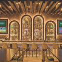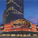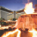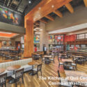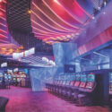
Architect Paul Steelman of Steelman Partners in Las Vegas is one of the world’s foremost casino designers, and has worked on projects from the Sands, Galaxy and Oceanus properties in Macau to Harrah’s in his hometown of Atlantic City. We caught up with Steelman on the road and asked him to share some principles of effective casino design.
CD: When it comes to casino renovations, is there a general rule about where to make the biggest investment and where to skimp?
Steelman: Casino renovations are simple. They usually include nine major items: carpet, hard surface pathways, paint, wall covering, gaming furniture (table tops, slot bases, slot and table chairs), directional signage, casino signage, decorative lighting and architectural task lighting.
We now believe casinos should feel smaller, so we are also suggesting structures within properties that promote the cocooning effect, to personalize the gaming product and the guest. Lighting is the most important, since casinos that opened 10 years ago are too dark for today’s customer.
Casinos used to be renewed every seven to eight years; now I see that being stretched out to 10 to 12 years.
When a gaming company renovates, it should not skimp on the quality. The cost of the renovation is not in the new design; it’s in the opportunity costs. When that casino floor is down for renovation there is financial loss. We have seen increases in gross gaming revenue of over 35 percent when a small renovation is completed.
What do you strive for in room design?
In the 25,000 or so rooms we’ve designed, we always go for contemporary lines—light, warm colors accented with colorful art and fabrics. For example, our new rooms at MGM Ho Tram are designed with the above qualities and yet have a design tie to the local style and culture. Room design in a casino is about the quality of sleep. Over-the-top decorations tend to interrupt our sleep patterns and make for tired gamblers.
You have said designers should do the opposite of what was done in the 1970s, and retreat from “dark, smoky, windowless areas.” Does that mean more natural light on and around the gaming floor?
Young people do not live in eternal darkness. Twenty percent of people in the U.S. smoke and 92 percent of those want to quit. Why would anyone propose a windowless, dark, smoky casino? We always want it to be a sunny day in our casinos.
Your design of the sports book at the Hard Rock is reminiscent of a stock market floor, which is a nice nod to Cantor Gaming. Your website says the red is supposed to suggest European race cars. Why is that?
You must not be a Ferrari fan. Ferrari is usually red, fast and aerodynamic, and that’s the look we wanted for the Cantor Sports Book. All people look and feel great standing next to a Ferrari. In one of our next designs I’d like to use my Electric Fisker as a design inspiration. When I drive it I get stopped at every stop light and asked, “What is that car?”
“What is” is a good thing in casino design. Pique the curiosity to explore, and you’ll have a successful casino.
You once said people don’t want to see themselves in mirrors in a casino; once they do, “the fantasy’s over.” Are mirrors still a must to avoid?
Yes, yes, yes! Mirrors also make the casino dark, which is bad for success.
You once said techno-rooms would be the standard, which has come to pass. Would you say technology is the must-have amenity now?
Room technology is just starting. One day your iPad will be your remote, your HVAC control, your credit card, your light switch… The wireless room platform will also assist the operator to maximize labor, minimize costs and save the world a lot of power and carbon.
Is the variegated carpet still the rule? Casino carpet design was once described as looking “as if Leroy Neiman threw up on it,” which is hilarious and used to be very true.
We’re trying to get the casino to look smaller, so new carpets have bigger patterns, less colors and less confusion. If the guest is confused by colors or patterns, two things will happen—they’ll leave sooner and the gaming equipment will not be as utilized (since its design will be lost in a sea of Leroy Neiman confusion).
But Leroy Neiman was a great painter of Las Vegas. Just visit the old corporate offices of Caesars.
Steelman’s Top 11
An architect’s take on the casino of the future
1. Designed smaller. If “big” is required, the casino will be designed to look small and personal.
2. Structures within structures. Smaller spaces within the larger spaces will be required in all casino designs.
3. Art as light. Artful, bold shapes and sculptures will perform some of the lighting and surveillance tasks.
4. Natural lighting. Skylights, windows, naturally lit chandeliers.
5. Curved pathways. Curved paths will pique the curiosity of the guest to explore the facility.
6. Separate the activities. Non-gaming entertainment will be provided, but game attractions will be kept in the area of excitement—the casino.
7. Areas match the customer. Casinos will be subdivided and designed in a stratified way—the transportation, food offerings and gaming offerings will each match a customer.
8. Clean architectural lines. Clean lines will accentuate the gaming equipment.
9. Bright lighting. Lighting will allow employees to pay attention to the tasks required and players to see the smiling faces of the dealers or casino personnel.
10. Red is the color of commerce. No mud brown.
11. The narrow bandwidth casino. The casino is designed for you, you and you. One resort does not fit all.


